What Makes Some Kitchens Feel Bigger (And How to Apply It to Yours)
By Amelia Harper | Kitchen and Home Living Writer | Updated July 2026
I have been in tiny kitchens that felt expansive and generous kitchens that felt cramped. The square footage on the floor plan told one story. The experience of standing in the room told a completely different one.
After spending years writing about home design and kitchen organisation, I have come to understand that the perceived size of a kitchen has almost nothing to do with its actual dimensions and almost everything to do with a set of principles that either work together to make the space feel open or work against each other to make it feel smaller than it is.
This matters practically for most people, because most people do not get to choose the size of their kitchen. You move into a home, and the kitchen is what it is. You are not going to knock down walls or add square footage. But you can change almost everything else, and in doing so you can transform how the space feels every single time you walk into it.
What follows is a thorough explanation of every principle that makes kitchens feel larger than they are, and how each one works at the level of light, perception, organisation, and design. None of these require a renovation. Most of them require only attention and intention.
A spacious-looking kitchen is often a well-organized one. Discover the habits behind consistently tidy kitchens and learn simple ways to reduce clutter and keep your space looking its best.
The Way Light Moves Through the Space
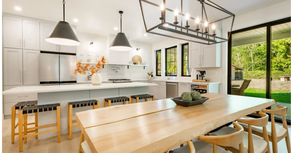
Light is the single most powerful tool available for making a kitchen feel larger, and it works on a principle that is deeply embedded in human perception: we read well-lit spaces as larger than dim ones. This is not a trick or an illusion so much as an accurate reading of the information our eyes are receiving.
In a dim room, the edges of the space are unclear, shadows compress the sense of depth, and the room feels enclosed. In a well-lit room, every corner and surface is visible, the full volume of the space is apparent, and the room reads as open.
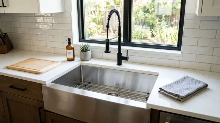
Natural light is the most effective form. A kitchen that receives good natural light through windows or a skylight will always feel larger than an identically sized kitchen with poor natural light, regardless of colour scheme, layout, or any other variable. This is why maximising natural light is always the first consideration in any kitchen that feels smaller than it should.
Maximising natural light in a kitchen you cannot structurally alter means removing what blocks it. Heavy curtains and blinds that are kept partially or fully closed reduce the light that reaches the room by a significant amount. Replacing heavy window treatments with sheer curtains that filter rather than block light, or removing window treatments from kitchen windows entirely where privacy permits, can dramatically change how much natural light enters the space.
The position and colour of surfaces near windows also affects how light distributes through the room. A light-coloured counter or backsplash near a window reflects light into the interior of the kitchen. A dark-coloured surface near a window absorbs that light and prevents it from reaching further into the space.
For kitchens with limited natural light, supplementary artificial lighting makes a significant difference. A kitchen lit only by a central overhead fixture creates shadows in corners, under counters, and in the work areas where task lighting should be, and those shadows visually compress the space.
Adding under-cabinet lighting to illuminate the counter surface eliminates the shadow zone created by upper cabinets. Adding recessed ceiling lights distributed across the full ceiling area rather than concentrated in one central fixture eliminates corner shadows and distributes light evenly, which removes the visual compression that shadows create.
Colour and How It Affects Perceived Space
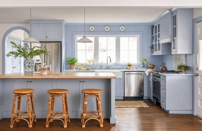
After light, colour is the most powerful variable in perceived kitchen size. The mechanism is well understood: light colours reflect light, bouncing it around the room and maintaining the brightness that reads as spaciousness. Dark colours absorb light, reducing the ambient brightness and causing the space to feel more enclosed.
This does not mean that a kitchen must be entirely white to feel large. It means that the dominant colour of the largest surfaces in the room has the greatest effect on perceived space. The ceiling, the walls, and the cabinet faces together represent the majority of the visible surface area in most kitchens. When these surfaces are light, the room reads as open. When they are dark, the room reads as smaller.
White is the most effective colour for making a kitchen feel larger because it reflects the most light and creates the least visual weight. But the off-whites, pale greys, soft creams, and light greiges work nearly as well and have become popular precisely because they achieve the same spatial effect with more warmth and character than pure white.
A useful principle is the light-to-dark gradient. Having the lightest colours at the ceiling and progressively slightly darker tones moving toward the floor is a technique borrowed from professional interior design that naturally conveys height and spaciousness. A white ceiling, pale grey walls, slightly deeper-toned lower cabinets, and a dark floor creates a gradient that the eye reads as depth from floor to ceiling, which makes the room feel taller.
Paint finish affects spatial perception as well. A flat or matte paint finish absorbs more light than a satin or semi-gloss finish, which reflects more light back into the room. In kitchens where every bit of light is valuable for the feeling of spaciousness, a satin finish on walls and cabinets reflects slightly more light than matte and contributes to a brighter overall appearance.
Vertical Lines and the Perception of Height
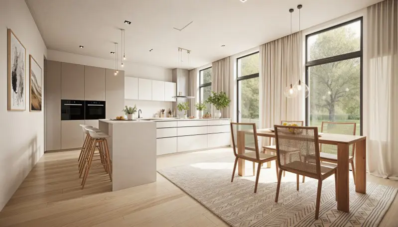
Human perception of height is heavily influenced by vertical lines. A kitchen where the eye is drawn upward feels taller. A kitchen where horizontal elements dominate visually feels lower and, by extension, more compressed.
Cabinet design illustrates this clearly. Full-height cabinets that extend from the floor to the ceiling draw the eye upward along their full length, emphasising the room’s height. Cabinets that stop at a standard height below the ceiling create a horizontal line at the top of the cabinet run that the eye follows across rather than up, and the empty space above the cabinets becomes a shelf for clutter that further emphasises the gap between cabinets and ceiling.
Filling that gap, either with cabinets that extend fully to the ceiling or with a deliberate architectural treatment like crown moulding that visually connects the cabinet top to the ceiling, removes the horizontal break and restores the sense of vertical continuity.
Tall, narrow elements in the kitchen, including tall pantry cabinets, tall refrigerators, and vertical tile patterns on the backsplash, all draw the eye upward. Wide, horizontal elements do the opposite. This is why a stacked subway tile or herringbone pattern tends to make a kitchen feel more energetic and taller than the same tiles laid in horizontal brick courses, which emphasise width.
Curtains and window treatments, where they exist in kitchens, have a strong effect on perceived ceiling height. Hanging curtain rods close to the top of the window or at the very top of the wall rather than just above the window frame extends the apparent height of the window and the wall behind it, making the ceiling feel higher than it actually is.
The Role of Reflective Surfaces
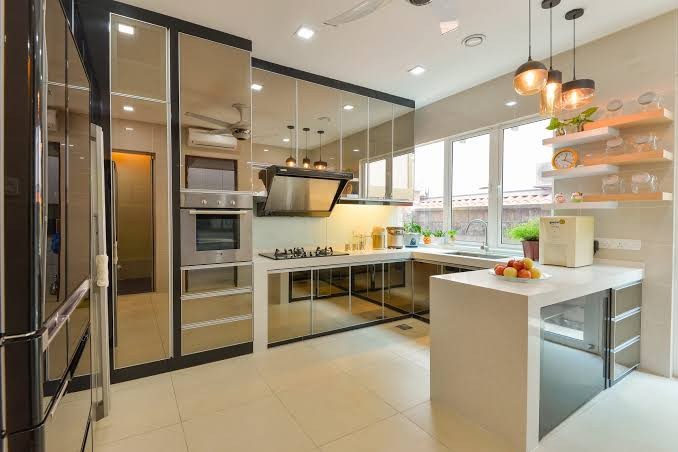
Reflective surfaces in a kitchen perform two perceptual functions simultaneously: they bounce light around the room, increasing overall brightness, and they create apparent depth by reflecting images of the space back at the viewer. Both effects contribute to a perception of greater size.
Glass-fronted cabinets reflect the room they face into while also showing the depth of the cabinet interior beyond the glass, which creates a layered perception of space. Mirrored or high-gloss backsplash tiles reflect the opposite wall and the light above the counter, effectively doubling the visual information in that portion of the room.
Polished stone or quartz countertops with a high-gloss finish reflect light upward, brightening the underside of upper cabinets and the ceiling above. Stainless steel appliances reflect the room around them and maintain a visual lightness that matte or coloured appliance finishes do not.
The relationship between reflectivity and perceived space is strong enough that a small change in surface finish on a major kitchen surface can have a noticeable effect on how the room feels. Switching from matte cabinet doors to high-gloss or semi-gloss doors in the same colour, for example, can make a meaningful difference in the brightness and apparent size of the room without changing any of its actual dimensions.
How Clutter Compresses Perceived Space
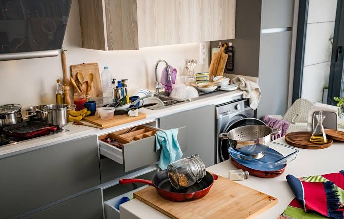
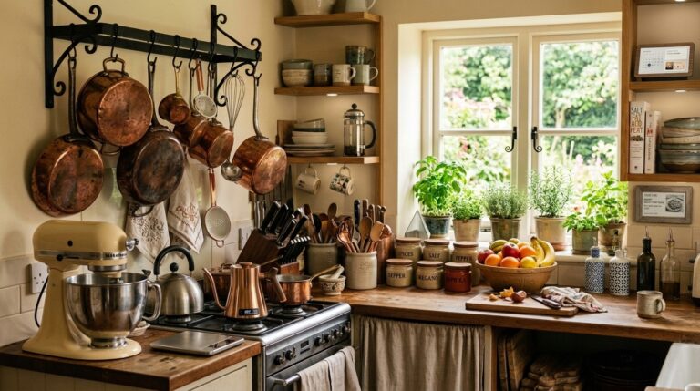
Clutter is probably the fastest and most reliable way to make any space feel smaller than it is, and the kitchen is particularly vulnerable to this effect because it is a working space with many small items that need to be accessible and that therefore tend to accumulate on visible surfaces.
The mechanism is perceptual. Each object on a counter, shelf, or visible surface occupies visual space as well as physical space. When many small objects cover a counter, the eye processes each one individually and collectively interprets the visual noise as a full, busy, compressed space. When the same counter is clear, the eye reads the full depth and width of the surface and the room behind it, perceiving the space as open.
This is why identical kitchens can feel entirely different depending on how their surfaces are used. A kitchen with clear counters, organised and hidden storage, and minimal visible clutter feels larger than the same kitchen with covered counters and visible storage even though the physical dimensions are identical in both cases.
Clearing the kitchen of non-essential countertop items is one of the highest-return actions available for making the space feel larger. Every item that moves from the counter into a cabinet or drawer removes a unit of visual noise and returns visual space to the room. The items that genuinely need to live on the counter because they are used daily are far fewer than most kitchens actually display.
The Effect of Consistent Materials and Colours
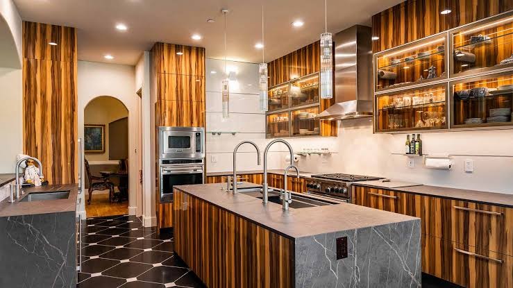
Visual consistency across the kitchen surfaces reduces the number of transitions the eye must process when scanning the room, which makes the space feel calmer, more cohesive, and larger. Every change in colour, material, or texture in a kitchen represents a visual boundary, and many visual boundaries in a small space create a fragmented, busy feeling that reads as cramped.
A kitchen where the upper and lower cabinets are the same colour, the countertop is a single consistent material without multiple segments or contrasting islands, the backsplash is a single pattern without several competing elements, and the flooring is a single consistent material throughout reads as unified and open.
A kitchen where upper cabinets differ from lower cabinets in colour, the countertop changes material at the island, the backsplash uses multiple tiles, and the flooring transitions mid-space reads as visually broken and consequently smaller.
This principle explains why open-plan kitchens that share flooring material with the adjacent living or dining space feel larger than kitchens where the flooring changes at the kitchen boundary. The continuous flooring material visually extends the kitchen into the adjacent space, borrowing square footage from the larger room perceptually even though the two spaces remain functionally distinct.
Extending the backsplash material in a consistent plane from counter level to ceiling height, rather than stopping the backsplash at the bottom of the upper cabinets and switching to paint above, creates a consistent vertical surface that reads as a single element rather than two, reducing the number of transitions the eye processes and making the wall feel taller and more unified.
Storage Density and Its Effect on Spatial Perception
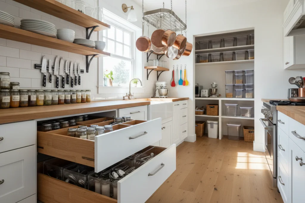
A well-organised kitchen where everything fits in its designated storage location and no item needs to live on a visible surface because all the storage space is full feels larger than a kitchen where storage is disorganised, overcrowded, or insufficient.
This is because inadequate or disorganised storage forces items onto surfaces, which creates the clutter discussed above. But it also because a kitchen where the storage solutions themselves are visible and numerous, with many different types of rack, holder, and organiser competing for wall space, reads as more complex and therefore more compressed than a kitchen where storage is primarily concealed within cabinets and drawers.
The goal of storage organisation is to maximise the capacity of existing storage, which keeps surfaces clear and allows visible surfaces to read as open. This is achieved through a combination of vertical organisation within cabinets, using stacked shelves and organisers to use the full height of the cabinet interior rather than a single shallow layer, and thoughtful editing of what actually needs to be stored in the kitchen, eliminating items that are duplicated, unused, or that belong in a different space.
A kitchen where every cabinet and drawer has a clear, organised system and where there is enough capacity for everything without overflow onto surfaces reads as spacious, functional, and under control. A kitchen where storage is over-capacity and items overflow onto counters reads as small and stressed.
The Impact of Flooring Direction and Pattern
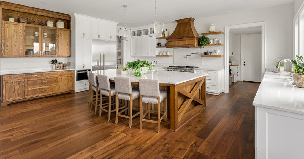
Flooring is one of the most underappreciated variables in spatial perception, primarily because once it is installed it is simply there and stops being noticed consciously. But the direction and pattern of flooring tiles or planks have a measurable effect on how large and deep a space appears.
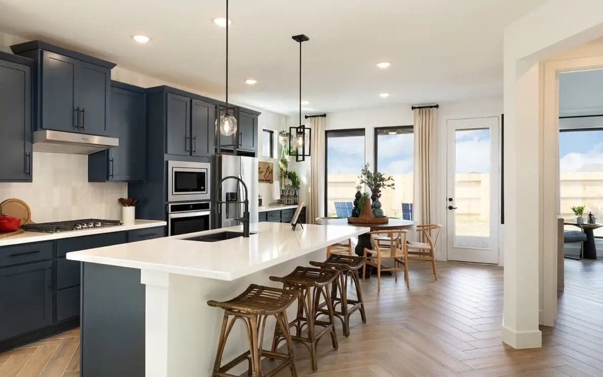
The direction in which plank flooring or rectangular tiles are laid determines which visual axis of the room is emphasised. Planks or tiles laid with their long axis running toward the furthest point from the kitchen entrance draw the eye toward that point and make the room feel longer and deeper. Planks or tiles laid perpendicular to that axis emphasise width rather than depth. In most kitchens, running the flooring toward the far wall, typically through the length of the room, makes the space feel deeper and therefore larger.
Diagonal patterns, where tiles are laid at a 45-degree angle to the walls, create dynamic visual movement that makes the eye travel across the full diagonal of the room rather than along a single axis. This can make a square or compact kitchen feel more expansive because the visual line the eye follows is longer than either the length or the width individually.
Large format floor tiles make a small kitchen feel significantly larger than the same floor covered in small tiles. The reason is grout lines. Small tiles create many grout lines, which segment the floor visually into many small units.
Large format tiles create fewer grout lines, leaving the floor as a more unified, continuous surface that reads as larger. The most extreme version of this principle is polished large-format stone or porcelain that reflects light upward as well, combining the benefits of large format with the spatial benefit of reflectivity.
Open Shelving and Visual Depth
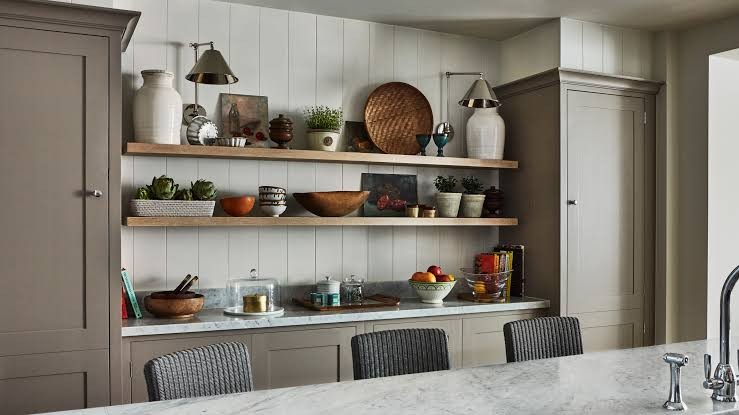
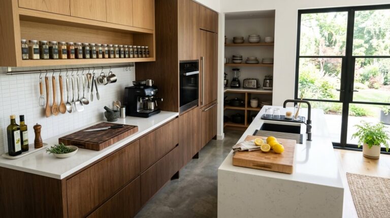
Open shelving in a kitchen, as a replacement for or complement to upper cabinets, creates visual depth by allowing the eye to see into the wall rather than being stopped at the cabinet door surface. Where a closed cabinet presents a flat vertical surface, an open shelf presents a recessed plane set back from the wall face by the depth of the shelf, and the wall behind the shelf beyond that.
This layering of planes, wall face, shelf surface, shelf contents, shelf back, creates a perception of depth that makes the wall feel further away.
This effect is most pronounced when open shelves are kept relatively spare rather than packed tightly with items. A heavily loaded shelf presents as much visual clutter as a covered counter. A shelf with a curated selection of items against a lightly coloured backing creates depth without the clutter that would negate the spatial benefit.
The lightness of the materials on open shelves also matters. Light-coloured dishes, clear glass containers, and reflective surfaces on open shelves contribute to the brightness of the area they occupy. Dark, heavy items stored on open shelves close to eye level can make the area feel heavier and lower than it should.
The Ceiling as a Spatial Tool
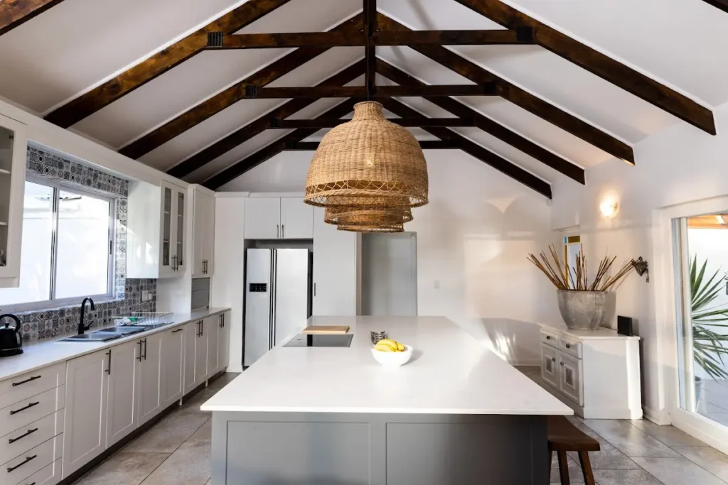
The ceiling in most kitchens receives the least deliberate attention of any surface, which is a missed opportunity because the ceiling has a significant effect on perceived height and volume.
A white or very pale ceiling reflects the maximum possible light downward into the room and makes the full height of the space feel accessible. A painted or dark ceiling draws the eye downward and makes the room feel lower. There are kitchen designs where a deliberately coloured ceiling creates an intentional cosy or intimate effect, but in kitchens where the goal is to feel as large as possible, white or near-white is almost universally the best ceiling choice.
The position of ceiling light fixtures relative to the ceiling surface affects how high the ceiling appears. Recessed lights that sit flush with the ceiling surface and direct light downward do not interrupt the plane of the ceiling and allow it to read as a continuous, clean surface at its full height.
Pendant lights and hanging fixtures that drop from the ceiling introduce vertical elements between the ceiling and eye level, which can make the ceiling feel lower and the room feel more compressed if the drop is significant.
Coffered ceilings, which introduce geometric depth into the ceiling surface, can paradoxically make a kitchen feel larger by adding visual interest that draws the eye upward rather than keeping it at counter level. This is the exception to the clean-ceiling principle and works primarily in kitchens with genuine height where the coffers can be proportioned appropriately.
The Proportion of Upper Cabinets to Open Wall
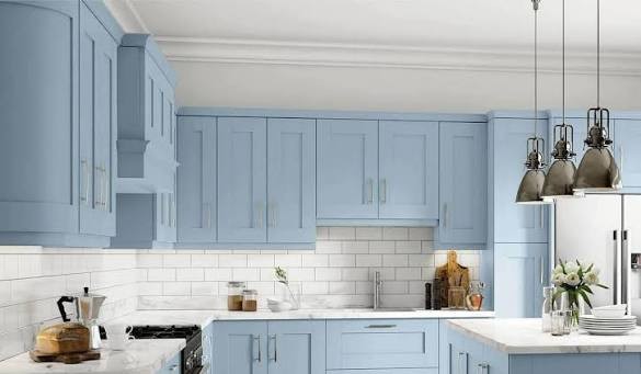
Kitchens where the upper cabinets completely fill the wall from counter level to ceiling on every possible wall can feel dense and enclosed even when the cabinets themselves are light in colour. This is a case where the desire for maximum storage works against the perception of space.
A kitchen where some wall space above the counter is left open, whether deliberately as a design choice with open shelves or simply because not every wall requires upper cabinets, feels more breathing room and more spacious than a kitchen where every available wall surface is covered.
This is not an argument against upper cabinets, which are essential for storage in most kitchens. It is an argument for considering which walls need them and which could be used differently.
A single wall left without upper cabinets, with a deliberate decorative or practical treatment instead, creates a visual break that relieves the density of a fully cabineted kitchen and provides the eye a place to rest that contributes to the perception of space. In kitchens that feel particularly enclosed, this single change can have a disproportionately large effect on the feeling of the room.
The Specific Effect of an Unobstructed Sight Line
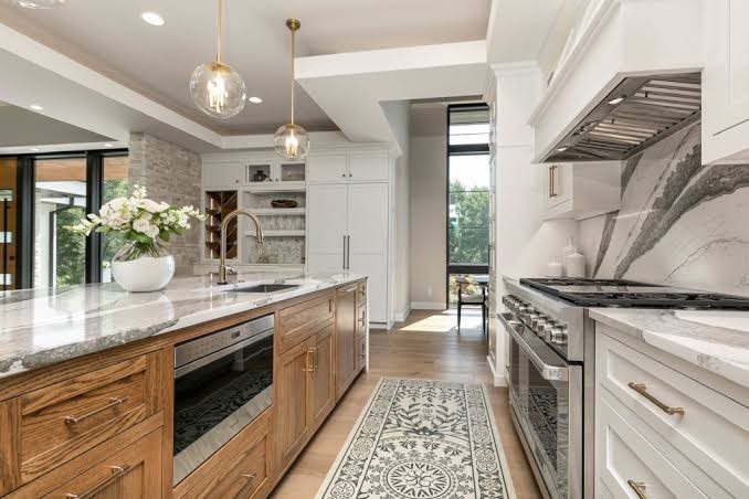
Perception of space depends heavily on how far the eye can travel before hitting an obstacle. In a kitchen where the sight line from the entrance to the far wall is clear and unobstructed, the eye reads the full depth of the room immediately and the space feels open.
In a kitchen where the sight line is blocked by a peninsula, island, overhead storage, or any other element that interrupts the view before reaching the far wall, the space feels compressed at the point of interruption.
This is why kitchens with islands can actually feel smaller than the same kitchen without an island if the island is positioned in a way that blocks the primary sight line. And it is why galley kitchens, which have very long unobstructed sight lines down their length, often feel larger than their actual square footage would suggest despite being narrow corridors.
Considering the sight lines in your kitchen and identifying what obstructs them is a useful exercise. Sometimes the obstruction is a piece of furniture, a freestanding organiser, or an item stored in the wrong place. Removing or repositioning it can open a sight line in a way that immediately makes the room feel larger without any other change.
Bringing It All Together
Every principle in this article works because of the same underlying mechanism: our perception of space is not determined by measurement but by the quality of visual information our eyes receive. Light, colour, reflection, continuity, clarity, and unobstructed depth all communicate openness to the brain in ways that feel genuine rather than illusory.
A kitchen that applies these principles feels larger because in the most meaningful sense, the one that affects how you experience the space every day, it is larger.
Most of these changes cost nothing or very little. Clearing surfaces, painting walls a lighter colour, improving lighting, running flooring in the right direction, removing unnecessary window treatments, and editing what lives on the counter are all within reach for any household. They do not require a renovation, a designer, or a significant budget. They require only understanding which principles are at work and applying them deliberately.
A kitchen that feels generous and open is one of the most pleasant rooms to spend time in, and the good news is that achieving that feeling is far more within your control than its physical dimensions suggest.